Over the past ten years the skyscraper has gone from an engineering marvel of mankind to being a creative marvel of mankind.
Few structures capture the imagination more than the skyscraper. We often know where we’ve been because of the buildings that punch into the skyline – the Empire State in New York City, the Freedom Tower, the Hancock Center and Sears Tower in Chicago, and the Renaissance Tower in Dallas.
Like all buildings representative of their times, skyscrapers are a dynamic and striking combination of culture and technology. The skyscraper was an invention born out of necessity in the late 1800s. As commerce exploded people poured out of the farms and from far away places to fill American cities. Rather than feed into some vast sprawling metropolis, buildings evolved so people could work and live in a compact, organized fashion.
Technology complied, enabling buildings to sprout out of the streets. Structural steel design (known as the Chicago skeleton as developed by Frank Lloyd Wright’s mentor Louis Sullivan) meant that the wall no longer had to bear the weight of the building. Thanks to reinforced concrete, window glass, and elevators, there was nowhere to go but up. Even the development of water pumps and toilets played a role.
Fast-forward to the new Millennium, a time when technology and culture once again bring on a new direction for skyscrapers.
For nearly the past 80 years, seeing a building reach 1,000 feet in the air was enough to impress, but the skyscraper profile was essentially straight, vertical lines. The extent of style for high-rises such as the Empire State and the Chrysler Building in New York or the Wrigley Building and the Tribune Tower in Chicago were gothic gingerbread on the top floors or art deco touches here and there.
The Great Depression and World War II sidetracked skyscraper construction, but when these buildings started to rise again in the 1960s, the style was now ultra rectilinear. By the mid-1980s, according to Karel Vollers, a researcher at Delft University of Technology, “people got bored with the box-shaped buildings.”
Vollers observed that architects began to explore using twisted surfaces. According to John Zukowsky, the former architectural curator with the Chicago Art Institute, architecture entered this new phase thanks to two developments. “Changes in computer power – that being computational fluid dynamics – opened up new creative horizons.”
“Now every client can have a building that is totally unique and individualistic.”
It is one thing to let the mouse wander over the computer screen leaving a trail of parabolic shapes. The real trick is making those forms functional and capable of holding up the weight of a building, providing efficient heating and cooling and withstanding effects such as high winds.
At the same time, Zukowsky credits the development of new materials for bringing these ideas to life. “Carbon fiber materials and new composites have found their way into architecture from other areas such as aerospace research.” “As a result,” Zukowsky notes, “people began experimenting.”
At the start of the 21st century nowhere has this experimenting been more evident than in the architecture and design of a skyscraper. Just as the Internet has lit a match to creativity, enabling ideas to spread around the world at the speed of light, inventive skyscraper designs are being seen on every continent, lining the Hong Kong Harbor and popping out of the sands of Dubai.
Antony Wood, the executive director of the Council and Tall Buildings and the Urban Habitat, sees the possibility that along with breaking away from the standard orthogonal box, tall buildings will be responsive to the environmental challenges of today’s world.
“The Gherkin”

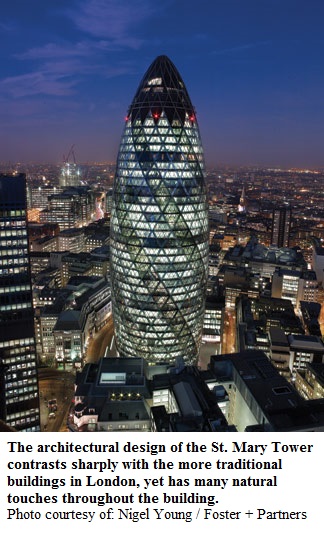
High-rise buildings are assuming shapes not dreamt of thirty years ago and employing designs which include “green” themes to minimize energy consumption and maximize some solar alternatives. One of the most unusual is the 30 St. Mary building in downtown London, with its profile earning it the nickname “The Gherkin.”
Erected between 2000 and 2003, the 591 ft, 41-story high office building’s distinct form has landed it roles in a number of movies and television programs. Among its energy-saving features are windows in the lightwells that open automatically to augment the air conditioning system with natural ventilation that save energy for up to 40% of the year.
Gaps in each floor create six shafts that serve as a natural ventilation system for the entire building, creating a double-glazing effect. Air is sandwiched between the two layers of glazing and insulates the spaces inside. These gaps also form atria to allow for gardens and social spaces for the tenants.
Usually double-glazing in residential houses is limited to avoid the inefficient convection of heat, but the St. Mary Tower exploits this effect. The shafts pull warm air out of the building during the summer and warm the building in the winter using passive solar heating. The shafts also allow sunlight to pass through the building, making the work environment more pleasing, and keeping lighting costs down.
The building’s fully triangulated perimeter structure makes the building sufficiently stiff to reduce wind-excited sways without any extra reinforcements.
“Thinking Out of the Box”
In Mississauga, outside of Toronto, Ontatio, Yale-educated Yansong Ma, founder of the Beijing-based firm MAD Studio, has offered up the twisting, curving design of the two Absolute World Towers. The 56 and 50 story condominium projects are under construction and will open in late 2009.
Ma won a worldwide competition held by the developer and he did it around a design philosophy. “I thought that maybe the high-rise could look closer to nature.”
The locals dubbed the first tower the Marilyn Monroe Building thanks to the contours of the building, which gets thinner in the middle as it rises. The lines of the Absolute World towers are focused on the horizontal plane as comprised by the balconies that wrap around each floor. The floor levels are slightly offset from the floor above and below it, enabling the overall look to be curvy as the building rises and making the views from each unit different.
The support system, mechanicals, service lines and elevator shafts are in the center of the building, but not visible as each floor wraps around it.
The Absolute World project is an example where computer capabilities played a large role in its design. “We used complex software to design the building,” recalls Ma. With each floor having a different design, the computer program enabled Ma to provide individual plans for each one.
Building With a Twist
Mr. Santiago Calatrava is an architect who is not bound by boxes and who, as he told an audience at the Art Institute of Chicago, sees buildings as a machine and the body as a machine and so combines them both. He did that quite literally for a building named the HSB Turning Torso in Malmo, Sweden, completed in 2005.
Architecture became sculpture because the building is based on a sculpture – the Twisting Torso, created by Calatrava. The former CEO of the HSB cooperative in Malmo saw the sculpture and asked Calatrava to design a building around that same concept. At 54 stories this is currently the tallest building in Scandinavia, a place typically not known for skyscrapers.
The Twisting Torso uses nine segments of five-story pentagons that twist as it rises; the topmost segment is twisted ninety degrees clockwise with respect to the ground floor. Each floor consists of an irregular pentagonal shape rotating around the vertical core, which is supported by an exterior steel framework. The two bottom segments are intended as office space and the upper floors house 149 luxury apartments.
Each floor is rotated to create the characteristic twist of the building. The facade is made of curved aluminum panels, with windows leaning either inwards or outwards, in order to follow the twist of the building. An exoskeleton around the building’s front face is made of tapered white steel tubes.
Following the concrete perimeter column, the exoskeleton’s single upright is fixed to the tower between each module with horizontal and inclined tubes. These tubes reach back to steel anchors embedded in shear walls at the building’s back corners. While the spine column takes perimeter vertical loads, the exoskeleton around it provides wind resistance and dampens the building’s vibrations.
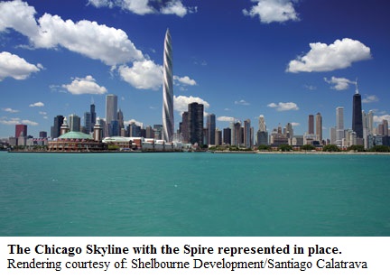
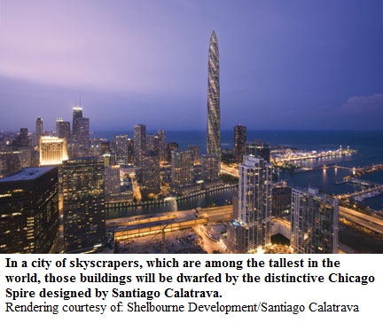
 Calatrava is following up with a more spectacular example of twisted architecture in Chicago, the birthplace of the skyscraper, with this year seeing the construction of the Chicago Spire. This building will be located on the bank of the Chicago River before it enters the harbor.
For the first time since the 1970s another building in the city will exceed the height of the tallest buildings in Chicago. At 2,000 ft. high, the Chicago Spire will be the tallest building in the world exclusively for residential use, offering 1,194 homes and over 1,400 parking spaces for the residents and their guests. The base to height ratio is ten to one (versus six to one for the Hancock Center), making it the most slender supertall building in the world.
Calatrava has designed the Chicago Spire with seven sides, with each floor rotated an average of 2.44 degrees between floor plates. When the top floor is reached, it will have rotated 360 degrees from the bottom floor.
The Spire is being built with water on three sides on a very small lot measuring just 2.2 acres. “For the Chicago Spire,” according to Kim Metcalf, the spokesperson for Shelbourne Development, the developer of the project, “wind is a huge challenge.” The way Calatrava deals with this is part of his creative process, taking his design inspiration from the columns of smoke rising from the Native American campfires lit along the banks of the Chicago River.
 As wind hits the building, like the column of smoke, it is redirected and spirals upward to eventually dissipate. The design was tested in a Newfoundland wind laboratory and, according to Metcalf, “the design proved right on the money.”
The Chicago Spire strives to meet Antony Wood’s charge for tall buildings to be part of the green revolution and is seeking to attain a LEED gold certification, “possibly working higher than that,” maintains Metcalf. Built on an old manufacturing site, the building’s seven-floor underground parking structure is designed to reduce environmental impact and heat gain, plus will have one floor exclusively for bicycles. Because of the tightness of the construction site, the garage is being built from the top down.
Though the Chicago Spire will dominate the cityscape, it will be very much part of the environment by including:
• A system to recycle rainwater for landscaping and cooling the building. The Chicago River will be used for cooling as well.
• Ornithologically-sensitive glass to protect migratory birds.
• An intelligent building and energy management system to provide efficient use of resources while optimizing comfort, contributing to an HVAC system that will be 15% more efficient than current energy regulations.
• Fresh air circulated into every unit, every 30 minutes.
• A unique waste removal system – once trash is dumped into the chute, metals, plastics and other recyclables land in the storage units completely separated.
• An elevator system running on reusable energy and comprised of 17 elevator shafts, which will be longest in the world.
Curious about the price to live in the Chicago Spire? A 534 sq. ft. unit starts at $750,000. For the panoramic view of four states and the curvature of the Earth, from the two penthouses which occupy the entire 141st and 142nd floors – a cool $40 million. Well over 30% of the units have been purchased, which will open in 2012.
Up until recently, engineering capabilities enabled designers and builders simply to go higher when it came to skyscrapers. Now thanks to new technology, the sky’s the limit when it comes to creativity.
By Keith Schmitz,
Guest Writer
Originally Published: Sept. 1, 2008

