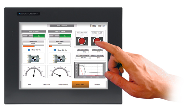
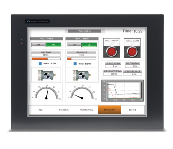
Do you have an HMI project coming up? Here are some tips for you to remember during your planning and implementation. The following four design principles are a great start for any design project (and the four letter acronym is nothing if not memorable):
- Contrast – Make sure that items which are different/important stand out
- Repetition – Make sure that “like” items are treated similarly (or identically)
- Alignment – Align items for readability, and so they can be scanned quickly. Vertical columns actually enable faster horizontal scanning
- Proximity – Group things that belong together, separate those that do not
Use Color… Judiciously
The ISA101 HMI standard recommends a more streamlined approach to HMIs and suggests using less distracting, more grayscale type displays. However, color, when used sparingly, can be very useful to operators especially when indicating an abnormal condition. If you choose to add color to your screens, use subdued colors that have a purpose and are not just there for aesthetics.
Keep Important Controls (Stop, Start, Setpoints, etc.) Available At All Times
Reserve a portion of the screen for these items; perhaps a band at the top or on the side for these controls, and make sure this area is completely consistent everywhere it is displayed. C-more offers a “background screen” feature that allows designers to create, edit, and maintain such an area in a single location within your project layout, and then display it across multiple screens as desired.
Display Appropriate Images
Although the ISA101 HMI standard discourages animations and 3-D graphics since they may distract an operator, an image of the machine being controlled or other real world images can be incredibly useful to help operators understand the location of problems like blocked actuators or sensors. Consider how a modern office copier can lead a complete novice to the location of a paper jam in seconds using clear images of the machine itself, locational pointers and even animated images of the flaps and hatches that must be accessed to clear the jam. But resist the temptation to model the entire P&ID piping diagram of the plant (or other process) – ask yourself if it’s just a pretty picture with numbers sprinkled over it, or an intuitive display of relevant information. If using 3-D images, don’t over do it and saturate your screens with image overload, not every piece and part needs to be seen so display only those images that are vital to the operation. If you decide to incorporate animated elements in your design, remember that it’s a fine line between being helpful and being a distraction, so use wisely.
Offer Situational Awareness
Make sure relevant data is displayed clearly, so that operators can grasp the current state of the machine or process at a glance (or as quickly as is practical). A good display answers both questions: “Where is the data/process now?” and “How does that compare to optimal conditions?” For discrete manufacturing, displaying data with respect to the “present state” of the machine may be enough, but for more complex machines or processes the screen design and layout should strive to help an operator predict the future status of a machine. Is it enough to know the current temperature of the oven, or would a trend graph allow the operator to foresee/prevent a pending disaster? There are many layout and design factors that can detract from situational awareness. Data overload and focus on the wrong information are two of the most common. If the situational awareness of the operator is critical to the success of a particular HMI project – there is a wealth of additional information available. One particularly good resource is: “Designing for Situation Awareness: An Approach to User-Centered Design” by Mica Endsley,
Keep All Info and Controls within 2 to 3 Clicks of the “Home” or Main Screen
Consider the workflow for the application. Which tasks are performed most often, and which are seldom used? Try to optimize the layout to be as efficient as possible. Keep screen menus and/or screen change actions as consistent as possible throughout the application, and have a clear and consistent “back path” so that even the least experienced operator won’t “get lost.”
Watch an Actual Machine Operator to Learn Their Interactions with the HMI
Sketch out early ideas on paper and “play act” their operation with an experienced operator. Deploy a prototype of the HMI before final commissioning if possible, and watch how the operator uses the interface.
 Look for awkward situations. Is there additional automation that can relieve the operator of needless button presses, or otherwise make them more efficient? Ask the operator for advice and opinion, but filter it, as the operator may not see the big picture. Realize, at the same time, that your engineering knowledge of the machine may cloud your perspective on what is actually required to operate the machine efficiently. Remember that a professional driver can operate a racecar at the edge of its performance capabilities without understanding every detail of the engine, chassis, and body design.
Give Feedback and Lead the Way
Give the operator visual (and audible) clues that buttons have been pressed, or that certain steps have already been performed. Affirmative feedback can build confidence, and satisfaction with the system. Use color and/or animation only when necessary to lead operators step-by-step through complicated processes. But keep things as simple as possible, and avoid unnecessary complexity – long lists of operator tasks may indicate “opportunities” for additional automation or other workflow issues. Two good questions to ask, from the operator’s perspective: “Where were you expecting to find that?” and “What were you expecting to happen?”
Beware of “Pop-up” Alarms or Dialog Boxes
Make sure that “pop-ups” are used sparingly, if at all. Nothing is worse than a cascade of error messages – all of which have to be acknowledged individually – before the operator can get to the screen where the condition can actually be resolved. Other techniques that can be used to draw the operator’s attention are simply changing the background color of an object, or section of the screen, or blinking objects (although this too, should be used sparingly). Overuse of blinking or flashing effects can habituate the operator to the effect, and thereby diminish its effectiveness as an alert, or it may even distract the operator from a more important issue elsewhere on the screen (see the tip above on Situational Awareness).
Date and Time Stamp Alarm Logging
Don’t just track the alarms – but also when they occurred. Many seemingly unrelated, recurring issues, may actually correlate to shift changes, coffee breaks, or even the startup/shutdown of nearby equipment or other periodic plant operations. Use alarm confirmation requirements to see how quickly operators are reacting to certain conditions, and consider refining the HMI layout/design for faster response, if desired.
Use Password Protection… Appropriately
Carefully consider what screens or objects should be available to all personnel, and which might be restricted to maintenance, engineering or management staff. Consider safety and the complexity of the items in questions. Realize that an overly restrictive policy can hurt productivity, or worse: result in the sharing of passwords with unintended personnel simply for the sake of “up-time”.
Create a Style Guide
Create a set of common styles to ensure consistency across all HMIs in a particular factory or plant. Consistent use of similar indicators, graphics, trend objects, etc. can increase operator familiarity and improve comprehension. C-more offers both an object library and a screen library, where you can store (and share) proven elements – or entire screens – for easy reuse across multiple projects.
One additional resource that may be useful, especially for process industries, is “The High Performance HMI Handbook” by Bill Hollifield, Dana Oliver, Ian Nimmo, & Eddie Habibi The book reveals many poor yet common HMI practices, provides the justification for change, and shows in great detail the best way to design and implement HMIs. It contains over 90 color illustrations, and many real world examples.
By Chip McDaniel, AutomationDirect
Originally Posted: May 21, 2015
Updated: May 07, 2021


