Human-machine interface (HMI) design standards vary and evolve, but end users always appreciate simplicity and clarity.
Bill Dehner, a Technical Marketing Manager at AutomationDirect, wrote an article for the February 2020 Applied Automation supplement of Plant Engineering titled Configure Intuitive HMI Screens to Simplify Automation, detailing some HMI configuration best practices. Here’s a summary, click on the link above for the full text.
Today’s consumers are familiar with—and often have opinions about—all sorts of the HMIs they interact with on their smartphones, cars, and more. Industrial factory equipment and systems have featured HMIs for many years, but they are typically less elegant than consumer devices, and really aren’t standardized. This article provides some tips for planning and implementing an effective automation HMI.
The High Performance HMI Handbook
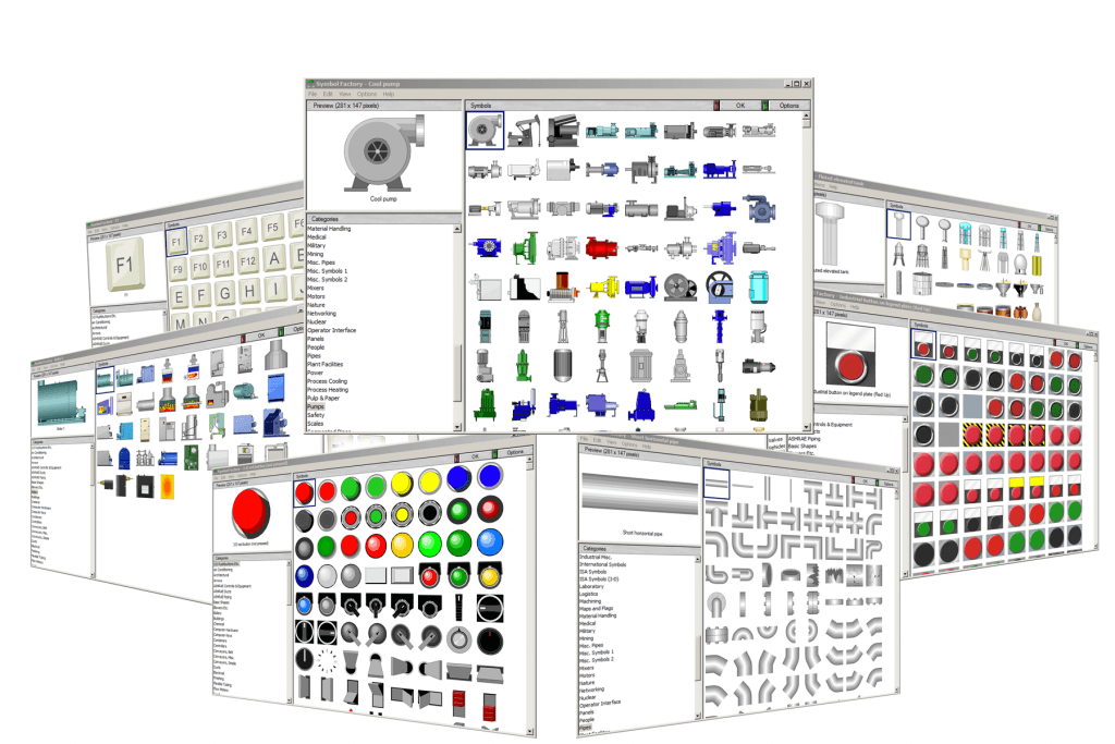
Don’t reinvent the wheel! Industry documents and standards like ISA101 provide HMI design guidance, and it’s sometimes industry-specific. Many HMI developers find the good (and bad) practices depicted in the book The High Performance HMI Handbook to be helpful. HMI platforms such as the C-more development software by AutomationDirect usually include many library design elements for equipment and indicators, providing standards and saving time.

Break it Down
An early step in HMI design should be identifying elements which will be used often, and then creating a standard design for each. Some objects relate to physical equipment like pumps and valves, while other logical constructs such as start/stop buttons, data entry/indication fields, and alarms must be carefully associated with programmable logic controller (PLC) code.
Build it Up
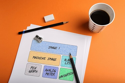
Storyboards—in any format and combination such as text outlines, spreadsheets, and sketches—are a great design tool to get team members from many disciplines aligned. Effective storyboards should indicate how operational systems and detailed information are displayed, and how users will interact with these elements. It is often useful to follow an organizational concept using levels:
- Level 1 Dashboards: Provide summary operating information at a glance
- Level 2 Typical Control: Streamlined operating screens, provide the essential monitoring and control options
- Level 3 Detailed Control: Detailed operating screens, with more options than Level 2
- Level 4 Specific Control: Very detailed popup, configuration, or diagnostics screens, not regularly used.
Five HMI Top Tips

Consider drafting an HMI style guide addressing the aspects of look, feel, and functionality. At a minimum, define characteristics such as:
- Navigation and
Availability
The most important controls should always be visible, while popups are useful for infrequent tasks. - Be Careful with
Color
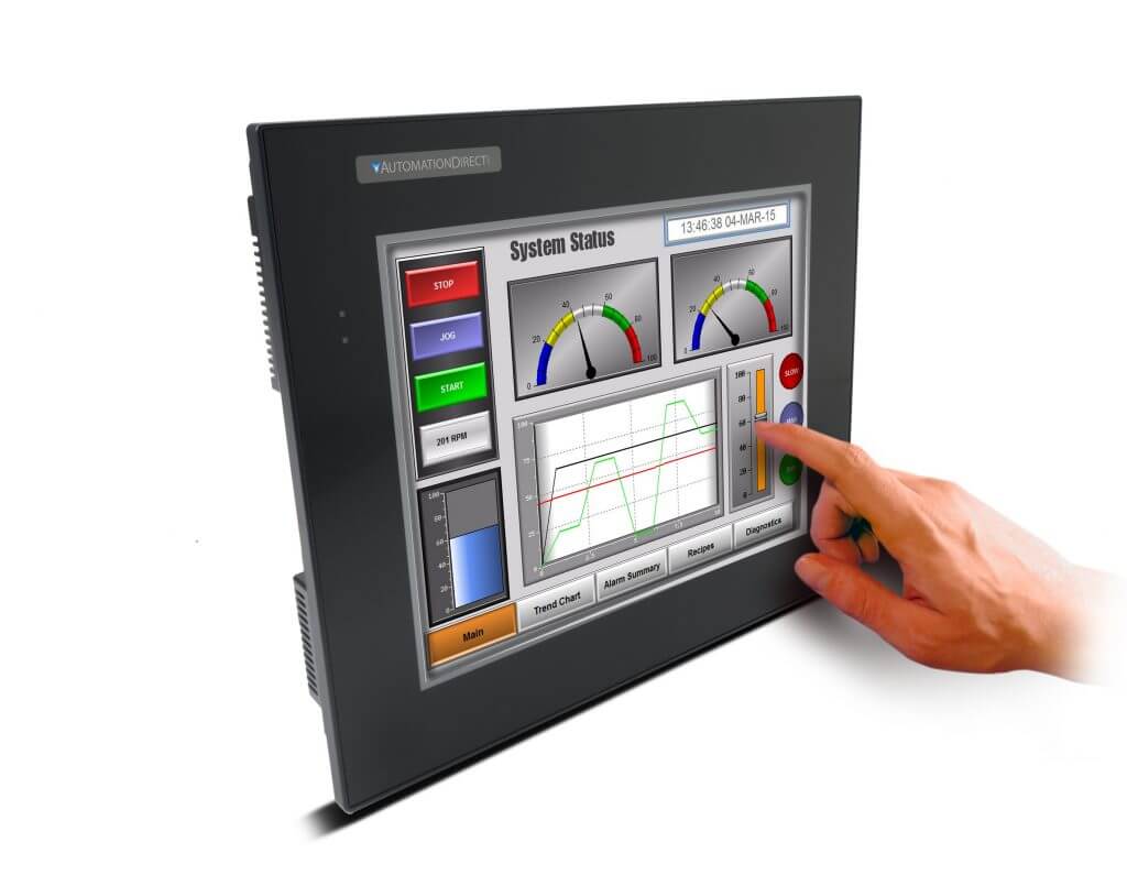
Many contemporary HMI styles advocate the general use of greyscale, reserving colors for important issues, but some applications require colors. Avoid using color indications too extensively by providing supplementary symbols instead where possible. - Define Text Data
Reserve larger/bolder fonts for titles and important data, and make it clear what is display-only and what is interactive. - Streamline Graphics
Best practice is to use simplified icons instead of complex animations, although sometimes images and animation can help operators locate trouble. - Usability First
Advanced features like embedded mini-trends and good alarm descriptions help users visualize current and recent conditions.

Situational Awareness
Good HMI design provides users with situational awareness.
The end goal for the HMI portion of an automated system is providing all relevant information so users can understand what is happening and know what action is required. All organizations, even those without significant engineering resources, can use the preceding tips to create clean and useful HMI experiences.


